description: the picture is of a big person with green hair resting her head on an entire planet. The planet is red and has crystals all around it, and other smaller planets are seen in the distance. the background also is space (black) and has stars and some blue colors as well. around the persons head is what looks like orbiting rocks and on her head are some crystals.
Analysis: the bright colors like green and pink are used to draw attention to it and the green hair on the person makes it the main focal point. also the black background complements the other bright colors in front of it. also crystal design is used and the girl is crying the river.
interrupt: the story behind this piece is that a girl gets made into a big giant and then gets lost in space and turns into an alien by getting green hair. shes said cause shes lost in space and the crystals on her head comes from the planet she found.
judge: i think it would be cool if the planet had some more blue in it, personally cause i do not like the green and pink color together and i think adding blue would look cool. also adding more planets in the background would make the it look more cool.
the size ill be using is 8×8 background color will also be a dark green and yellow
critique
thinks its a cool idea because he likes frogs, and also the color green. thinks that i should not put any of the crystals on the frogs head of face but only focus on the frogs back. also thinks that i should really put in the effort to add as much detail as i can into the frogs skin.
description: the photo looks a lot like the twin towers and around it is time square. it looks nice because the bright colors and squares represent what time square really looks like at night. Also the the stars look kind of like when the ball drops and all the fireworks go off on new years day.
Analyze: the linear perspective that they used on the walls of the side of the buildings was used to vanish into a single area which is the center buildings. Also by over lapping the squares on the buildings also add lots of depth to the photo. The bright colors draws attention to it for example if it was in a website, it would catch my attention due to the very vibrant colors.
Interpret: i think the story behind this photo is that its simply just a picture of new York on new years day and when the ball drops, which is shown by the fireworks on the ground. but more importantly i thinks its a picture of the twin towers last new years eve celebration or something.
Judge: i think its good considering that it was not made by a computer but by hand. the colors look really cool but i think it would look better if the floor was not just a line of different shades of blue but added actual people at the bottom. I just think he should just add more detail to make it look cooler from a close up perspective.
Analysis: the truck is very detailed and the people are made out of wood maybe. the truck is dirty and has lots of dust and dents on the side, so it probably was going over harsh roads.
the people look like good people that are just trying to get away from something bad, but something that took most of their belongings because they aren’t carrying any things but their still leaving. Maybe their house burned down or somthing.
something to add would be adding something inside the truck like more people or some kind of logo instead of the plan blue side. also could add more people because it looks obvious that all those people will fit inside the truck.
the picture is very color full and detailed, and the artist did a very good job on the shading and the clouds on the mountains. also the sunshine onto the mountains and the barn is accurate and cool with lots of color and detail.
the artsit could have moved the car to a different placed more off centered, and it would have looked cooler. also the trees in the background could have been a little more alike the trees directly next to the cars and the propel inside it.
the story that could be happening in the painting is that the girl and the boy inside the car just got kicked out of their previous house and now are driving to Oregon to find a better life.
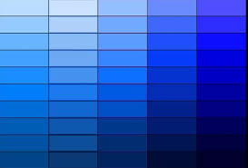
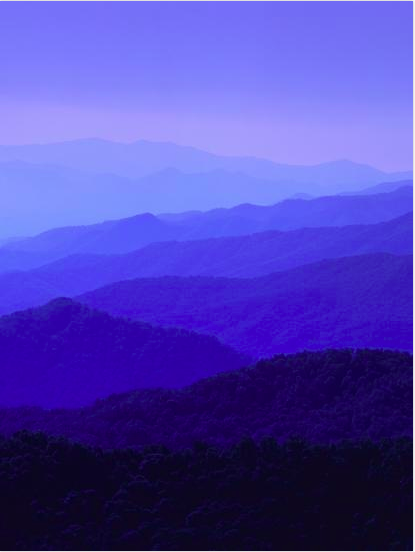
this is the photo reference i will be using for my tonal vector landscape with a least 5-10 layers
my monochromatic color schemes will be
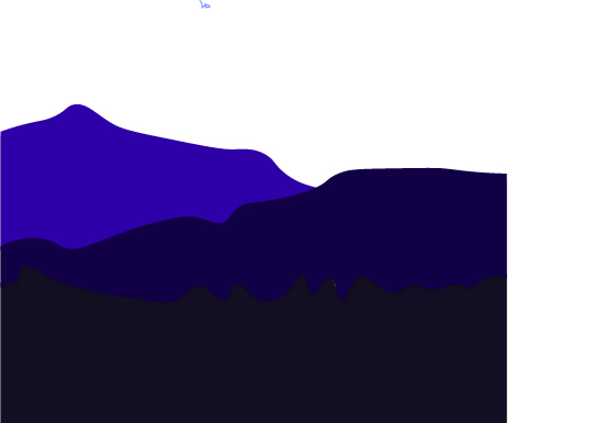
my foreground images will be
my foreground image will be
Tag peer review: Tyler
tell the artist something you like: the color difference in the background
ask the artist a question: what do you plan on putting into your foreground
give the artist a suggestion: color blending between layers
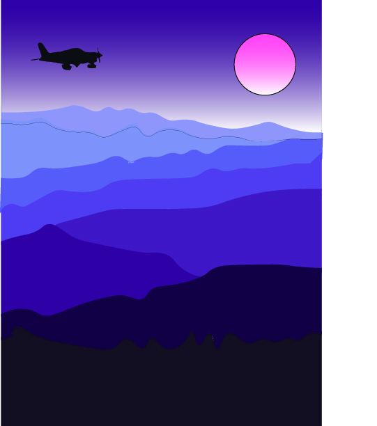
final art work
arstist statement
my art work is a bunch of cold mountain in the morning and then the plan is flying over in the distance
i created the art work by using my pen tool and outlining each mountain desperately and filling it in with the correct color and i made a cool looking sky with the gradient tool
the big idea of my art work is to show what the cold mountains look like during the morning also it shows how cool the color blue can be
i like what i made it turned out like i imaged it would turn out. i really like the sky and the sun color i thing the gradient color tool thing was really cool.
Tag Creique Tyler
they said they really like the color sceme and the sky and the sun.
he asked me how i made the sun and the sky the fading colors
he said that i could fix the faded line on the top mountain and put them together better
My dad has been the most influential person in my life
I do not have a nickname
Biggest fear is heights
I’m most passionate about sports
Favorite food is ice cream
Most proud of are my grades
I wanna play baseball when I grow up cause it’s fun
I’m the happiest when I’m with my friends and my happiest memory is when we started summer vacation
My super power is super vistion
I like to play sports for fun
The quote is “do the hard things when their easy” because it’s very true
I have 2 sister a brother two parents and two grandparents who live with me
I have a dog named muffin
My favorite book is The Maze Runner
My favorite class is science because I’m good at it
FriendsThis is a picture that I drew in class
Artist statement: I think I did a good job on the shading part of the drawing and getting the correct shading colors. But I could have done a better job on making the shoe more curved.
Painting critique:
I really like the way the hair looks like it is behind the other pieces of hair.
I also think that the color of the hair is the perfect brown
I think they could improve the birds wings and make it more fluffy and not so much of a sharp edge because birds wing aren’t perfectly straight.
I think it describes someone sleeping and dreaming.
This is my favorite piece from the art show case because the colors look really nice together
This picture I think just discribes the environment of Mercer island with all the green
I like the blue and purple the color variety is really cool.
I think they could use a smaller brush so they can get more detailed in the stuff like the octopus and the school.
I think the meaning of this pitcture is being advandous discovering new things.
I like they way the space man looks like he’s floating instead of looking like he’s standing still.
I would make the shape of the planted better and more rounded like on the ring of the blue plantet.
My artist statement: I think I did a really good job making the size of the shape as big as if it were taken with the size of the paper. Also I think I did ok on the colors except a lot of them bleed in. The shapes I think were alright except it was very hard to do the joy sticks. The main struggle was making the buttons in the same spot. I couldn’t get the size of the bottoms matched up with the size of them in my real picture. Also getting the angle down of the spot it was taken, drawing from that angle was hard.
My favorite part of my self portrait in the hair I think I did pretty ok on that part.
I could improve on the size of the head and the jaw line.
Making everything slimmer I think would have made this look better.